


+++Silver Golden Demon Winner+++
Entitled “Boot to the Head”, or “Hammer of Wrath” this is the 2012 GDUK Silver winner in the duel category. For the first post in this series click over here, it breaks down the enormous construction phase that went into creating the base models. The previous post showed the details that went into painting one half of the duel, the Wych. Now we will move onto the Seraphim.

Kirsten:
Having spent 4 months converting her, actually putting a coat of undercoat onto the Seraphim was a really hard thing to do.
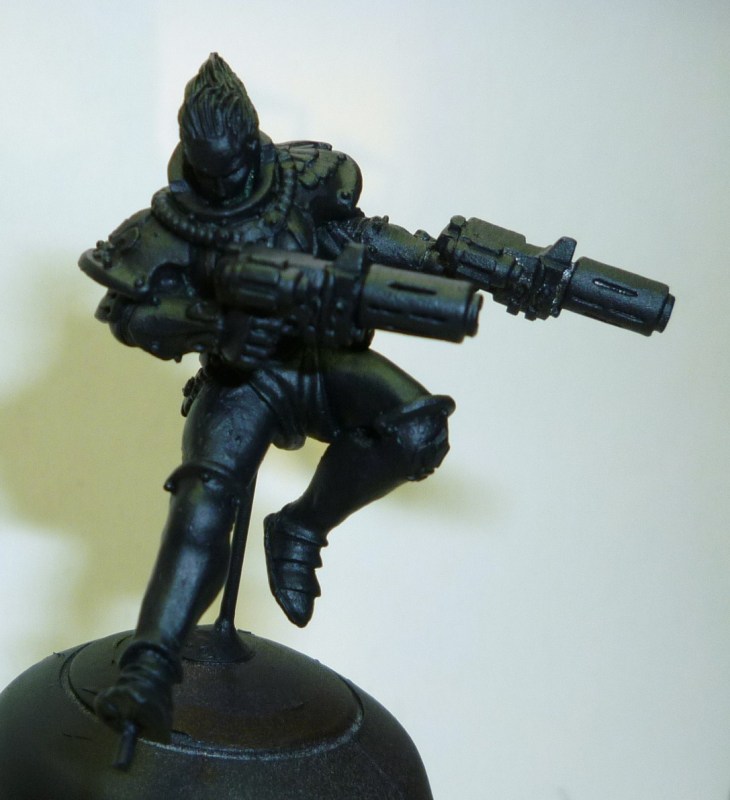
You might think spraying her black when she was going to be 90% white was a daft move, but the simple fact is I a) hate painting over white undercoat unless I absolutely have to, and b) have had bad experiences with white spray in the past so am paranoid about it going all rough and bobbley.
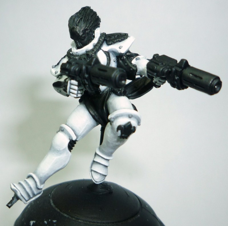
The white on the Seraphim took a long time, and had a lot of watery feathering done between each highlight. White is very easy to make look chalky or stark, and I didn’t want that. The only really obvious line highlight is the final one in pure Skull White, as I went for “light grey with a white highlight” more than “white with some shading”. For all that I wasn’t going for comic, I thought she would look better with a slightly more obvious highlighting than a realistic one, hence the fairly stand-out final Skull White highlight.
Once the white was complete, all the other areas got neatened up with black once more.
Colours:
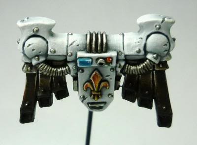
Codex Grey / Fortress Grey: 50/50, Fortress Grey, Fortress Grey / Skull White: 60/40, 20/80, Skull White. Rivet shading was done using watered Codex Grey.
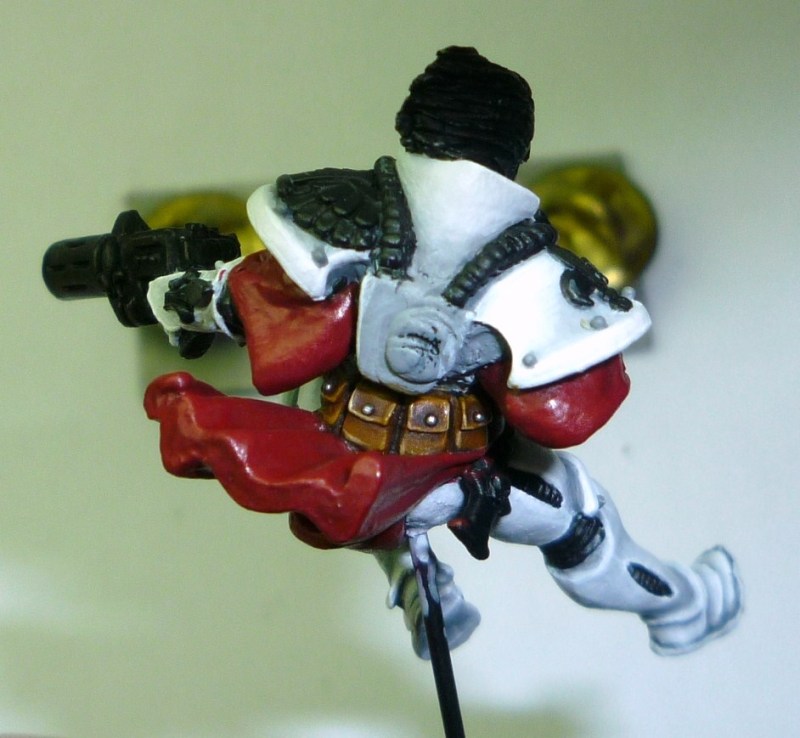
It wasn’t until I’d done the basecoat of the red that I realised it would be a very bad idea to do the pouches after the red. So out came the browns…
Colours:
Bestial Brown, Snakebite Leather, Bubonic Brown, Devlan Mud wash, Bubonic Brown, Bleached Bone.
As the most vibrant colour on the Seraphim, the red needed to be really rich and smooth. After trying my normal colours, I gave that up and tried again with some old reds I had sitting in my cupboard.
“Nice Dark Crimson” is a really old pot, with a hand-written label. I presume it was a test colour from years back. It’s like Scab Red, but slightly lighter and redder. My Crimson Gore is in an old round-top white-lid pot (90s sometime). Double Pigment Red is another test colour from years ago, and I was given 4 or 5 pots, and oh my god, if they released this it would sell over every other red out there. Hobgoblin Orange is likewise an old round white-top pot.
Colours:
Nice Dark Crimson, Devlan Mud wash, Thraka Green in recesses, NDC, really old Crimson Gore, Crimson Gore / Double Pigment Red: 60:40, 20:80, Double Pigment Red.
Line highlights: Blazing Orange, Hobgoblin Orange, Bronzed Flesh, Bloodletter Glaze.
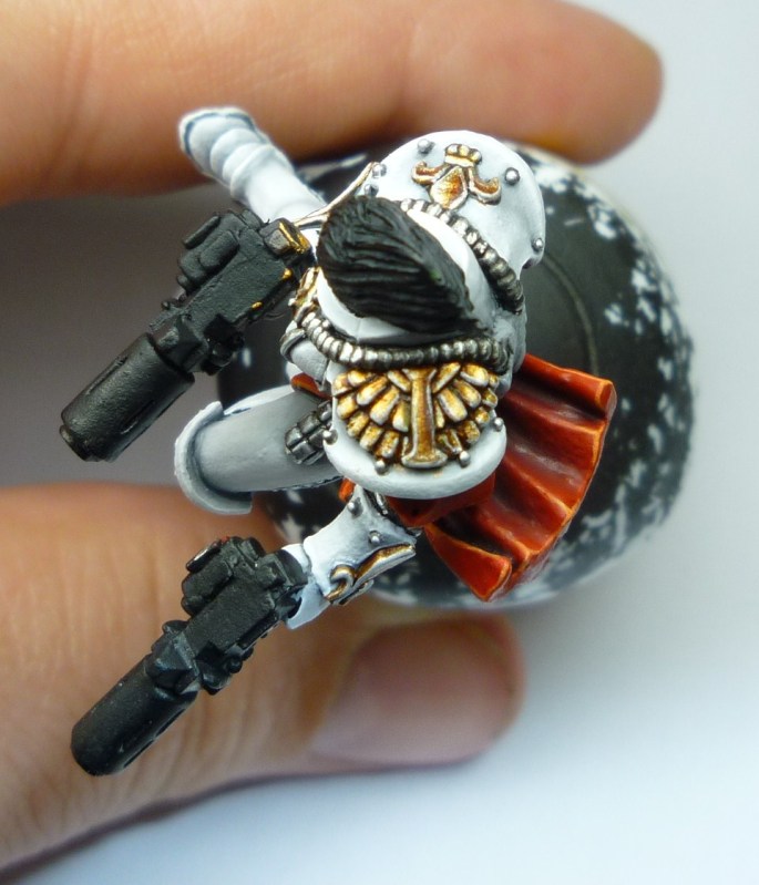
The silver bits got my usual “Oh I hate doing you” treatment, but I wanted the Gold to look nice and feel warm, so I lavished a tad more attention on that. Adding the Thraka Green to pretty much every colour helped tie them all together nicely. I’m sure there’s a technical reason and phraseology for it, I just do it because it works.
Colours:
Silver: Boltgun Metal, Chainmail, Milthril Silver, Badab Black wash, Mithril Silver, Mithril Silver / Skull White: 50/50.
Gold: Shining Gold / Scorched Brown: 50/50, Shining Gold, Chestnut Ink wash, Shining Gold, Shining Gold / Mithril Silver: 60/40, Brown Ink / Scorched Brown: 95/05 around detailing, Thraka Green in recesses, final highlight Mithril Silver.
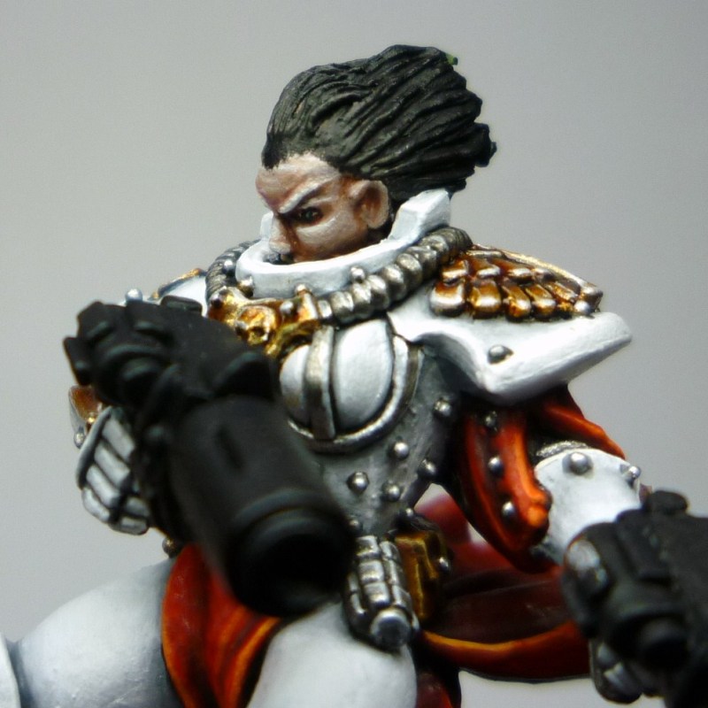
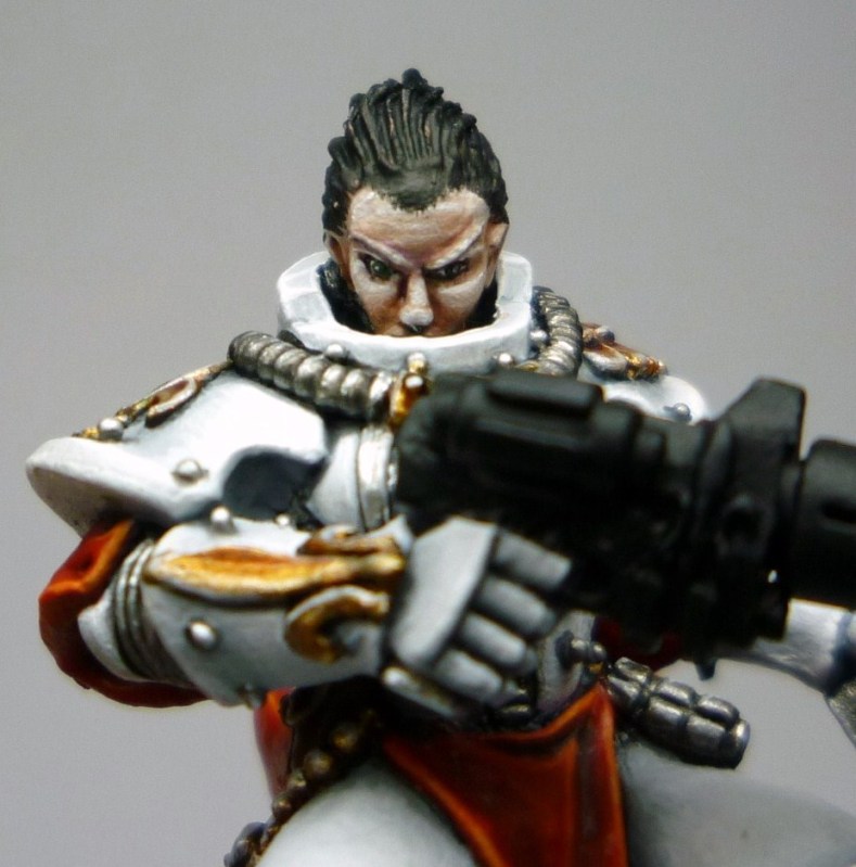
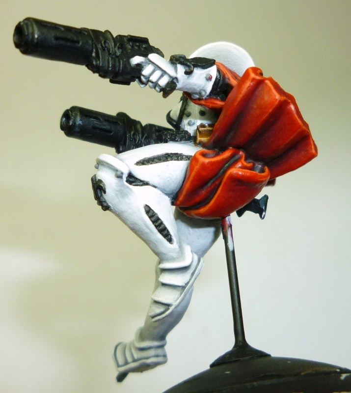
The face posed an interesting problem – the skin had to be healthier than the Wych’s skin, but not so dark that is looked out of place amongst all the white armour. In the end I think it turned out a little too pastel, but I could live with that. I also had to avoid using too much non-flesh colour, because again it would stand out too much against the white. Another subtle addition of green, this time in the eyes, helped with the balancing of all the red.
Colours:
Tallarn Flesh, Ogryn Flesh wash, Tallarn Flesh, Tallarn Flesh / Dheneb Stone: 50/50, Dheneb Stone, Skull White. Selective shading was done with Ogryn Flesh and Leviathan Purple. The whole lot was toned down using very watery Tanned Flesh. Deep recesses shaded with Liche Purple.
Eyes: Ceramite White, Snot Green, Chaos Black, Skull White dot.

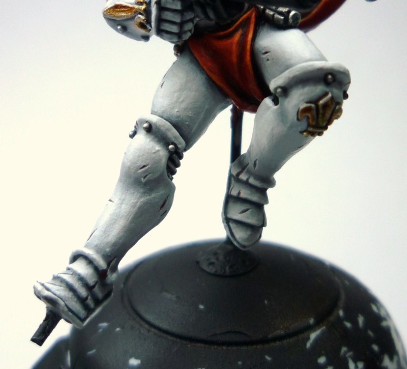
Next it was time to make her not so pretty. Sisters aren’t the most combat-oriented army in the universe, but they aren’t the worst by a long shot. And if one is going head-to-head with a Wych, then she’s got to have some battle experience behind her. So it was time to chip up her armour.
Power armour is supposed to be mostly ceramite, which isn’t metallic-based. So – same as was done for much of the Space Marines colour section – the battle damage was done with a ceramic base. It doesn’t show unless you look *really* carefully, close up, but that’s what the judges would do. The ceramic colour also adds to the warmth of the figure in it’s own way.
The initial slashes and chips were plain Grey, then another smaller line was painted inside it in Dark Flesh to represent the ceramic insides. Then the top edge of each and every one was given a thin white highlight.
Colours:
Adeptus Battlegrey, Dark Flesh, Ceramite White.
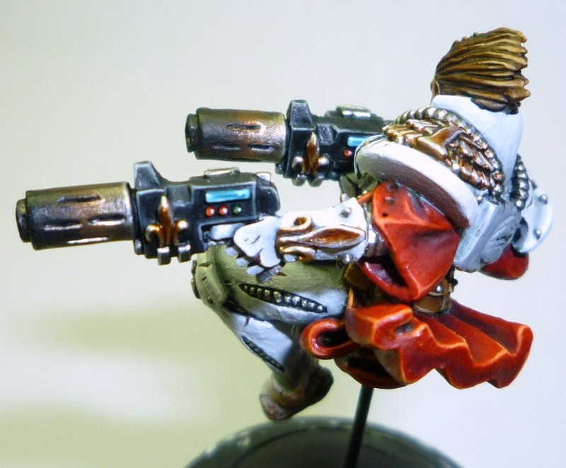
And now the final detail were added. The guns received their weathering, and I ceased hating them quite so much. Very heavy drybrushing, starting with the browns and working up to black obliterated most of the hated metallics.
Detailing on the guns added another bit of contrasting colour to the figure. Given the amount of black on the Wych, I decided on brown for the Sister’s hair. It also helped maintain the warmth of the figure, and didn’t draw undue attention from the centre of the piece. It also provided me with an ink splodge on the gorget that needed sorting afterwards.
Add to that a little weathering on the feet, and the main part of the Sister was done…
Colours:
Weathering: Bestial Brown, Scorched Brown, Chaos Black
Hair: Scorched Brown, Calthan Brown, Brown Ink wash, Khemri Brown, Khemri Brown / Bleached Bone: 50/50, Seraphim Sepia wash.
Gun screens: Hawk Turquoise, Hawk Turquoise / Skull White: 50/50, Skull White.
Double Pigment Red, Hobgoblin Orange, Skull White.
Dark Angels Green, Snot Green, Skull White.
The stages on the Jump Pack were pretty much the same as on the Seraphim herself – the weathering was just a LOT heavier.
Then a final selection of pictures of everything together! I present to you the Golden Demon 2012 Silver winner in the Duel category “Hammer of Wrath!”
 |
| Golden Demon 2012 Silver winner in the Duel category “Hammer of Wrath!” |
 |
| Golden Demon 2012 Silver winner in the Duel category “Hammer of Wrath!” |
 |
| Golden Demon 2012 Silver winner in the Duel category “Hammer of Wrath!” |
Hey Kirsten, just came across this post now thanks to Squaduary and Golden D6. Looks fantastic. Good to see some more Sisters out there. Did you paint for the ‘Eavy Metal team years ago? I recall a Kirsten Williams paint a white armoured blue robed Sisters army for White Dwarf. I play Sisters too, which I why I remember that archived White Dwarf.